

Color Story: Melodrama

Welcome to the first installment of The Yolk’s monthly feature: Color Stories!
Color is one of the most important elements in graphic design. It has the power to communicate so many aspects of a design including who the design is for and how it should make you feel. Color can create instant recognition and commands a strong psychological response. It has the power to represent everything from businesses and products to cultures, religions, organizations, and beyond.
For example… Think about some of the brands you encounter in your daily life — without hesitation you can probably name the colors of the logos for McDonald’s, Starbucks, and Target. Did you just think to yourself: yellow, green, and red? I bet you did!
How about a more cerebral test? What color conveys sadness? Anger? Joy?
Color is complex and impactful. Even within a single hue, so many nuances are possible. From the tint, tone, and shade, to the pairing with other colors, the potential of any color is endless.
The concept behind Color Stories is to introduce a specific hue and its color formulas, along with curated palettes, selected images to show the color in action, and — my favorite part — a monthly design challenge.
So, read on to learn all about this month’s Color Story: Melodrama.

Melodrama is a vibrant, versatile shade of blue. Inspired by the cobalt blue pigment used in decorative vases and ceramics, this color demands to be seen. Melodrama is a pure, saturated blue tone with the brilliance of a sapphire and the coolness of a clear sky at dusk. Similar to Pantone’s color of the year, Classic Blue, but with even more intensity, Melodrama is a bold choice for any design.
The vividness of Melodrama truly shines when used in digital applications as the luminosity of digital devices lends itself to the intensity of this gorgeous color. With almost equal parts of cyan and magenta, undiluted by yellow or black, this color will remain bold and saturated when used in print as well.
MELODRAMA MOOD
This color can be found across the board in contemporary art and design. Use it in a large color field with pops of equally intense versions of the other primary colors—red and yellow—to really pack a visual punch.
This color is cool, sophisticated, moody, and rich.
Melodrama creates an unexpected, yet polished statement in packaging design, fashion-forward photography, and cinematic illustration.
The name of this color was inspired by the Lorde album of the same title, which features this deep hue in the cover art.
“Because ours are the moments I play in the dark / We were wild and fluorescent, come home to my heart”
COLOR PALETTES
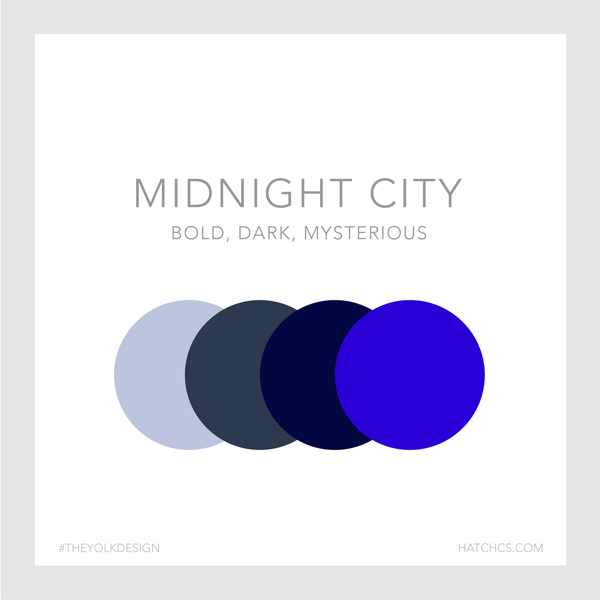
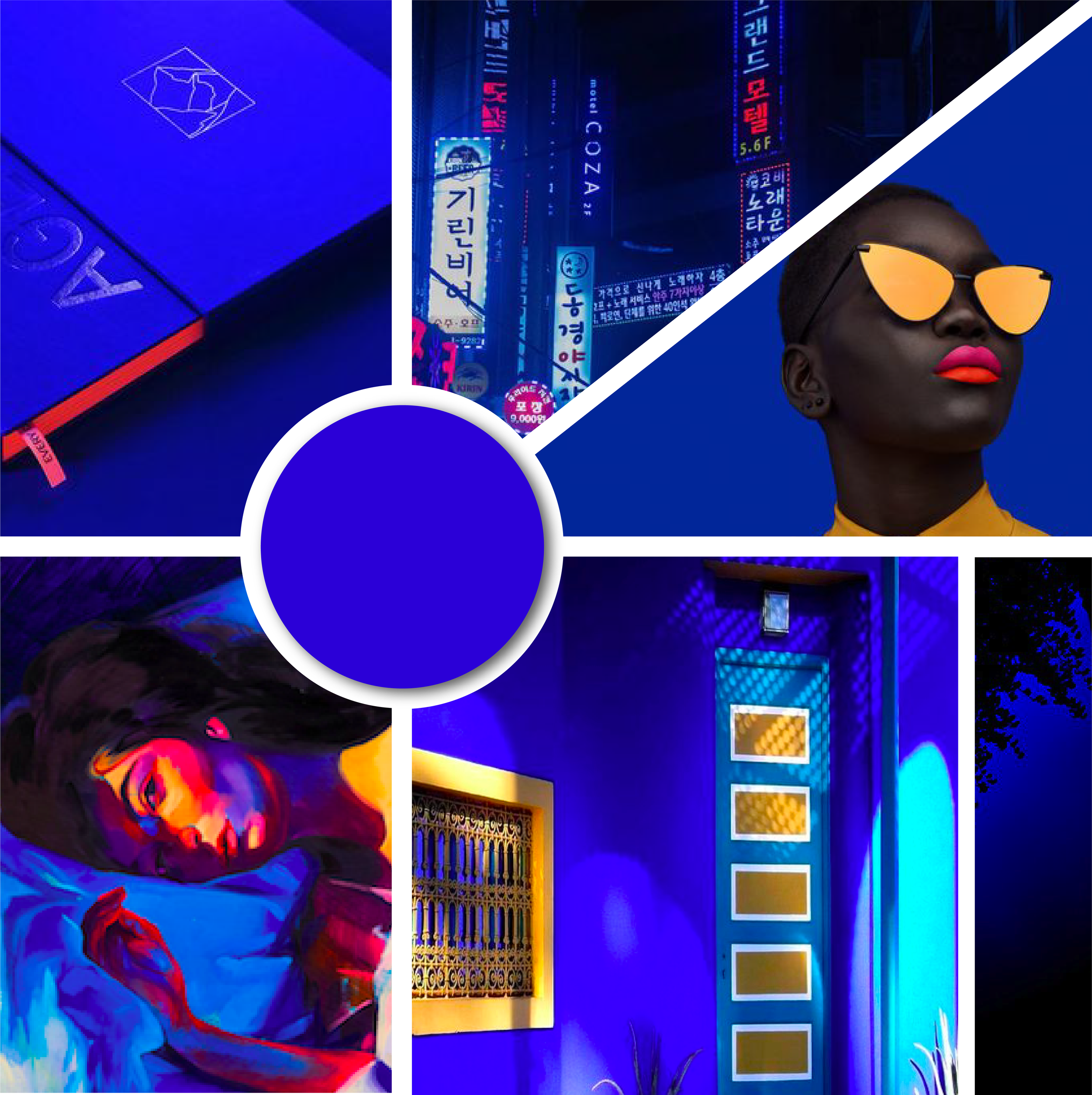
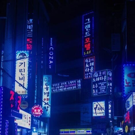
MIDNIGHT CITY
Never underestimate the power of a monochromatic color palette! This color combo utilizes tints and tones of our star hue in a range of values from a pale, smoky blue-gray to a deep, saturated navy blue. As seen below, this dark and mysterious scheme can elevate any design.
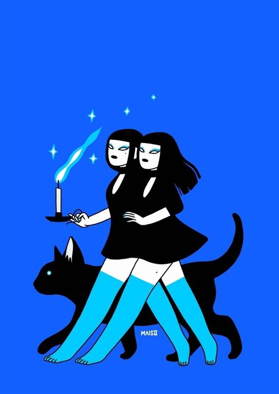
Inspiration Image Credit (L to R): Fufu Studio-Tumblr. Ebay Neon Sign. Mais2-After Midnight. Ryan Nicole Photography. (All photos have been linked to original source.)

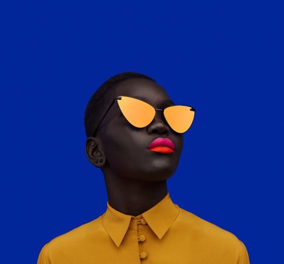
BRIGHT & QUIRKY
This playful color palette is by far the most popular and trendy out of the three. Designers and illustrators alike are just loving the combination of bright Melodrama with pops of equally bright of red-orange set against muted pinks and creams. The result is fun while still retaining the sophistication that Melodrama promises.
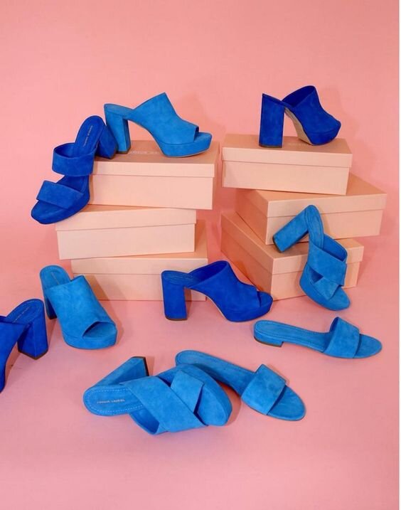
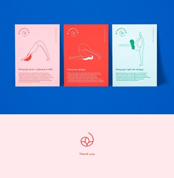
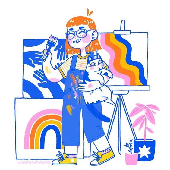
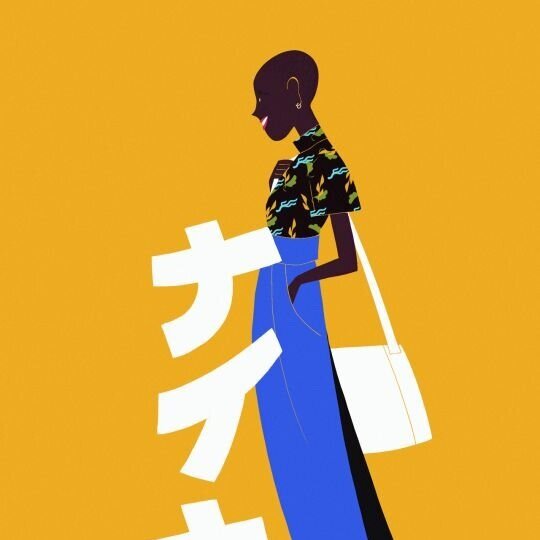
Inspiration Image Credit (L to R): Mansur Gavriel. Clemence Gouy-Les Bons Vivants. nuo studio-Przestrze Yoga Branding. Ada Crowe Illustration-Instagram. (All photos have been linked to original source.)

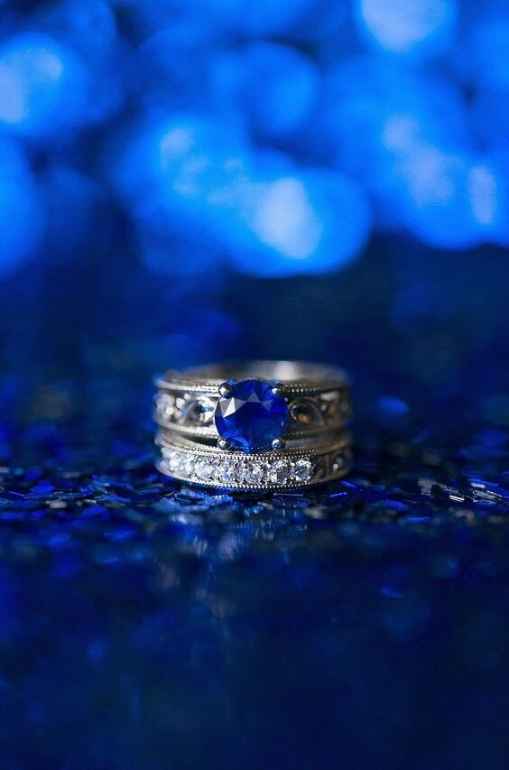
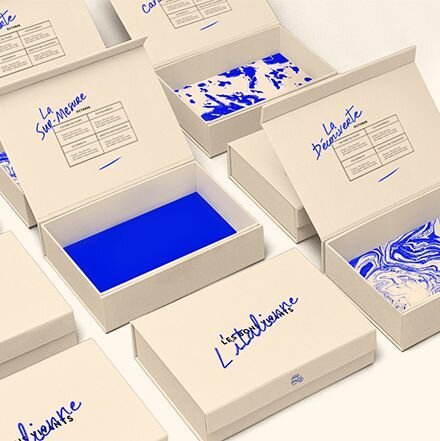
COBALT COUTURE
Use all four colors, or pare it down to just two or three, any way you slice it, this hot palette is a total show-off. And while bright brights are all the rage right now, it’s important when working with this level of intense saturation to keep the balance of each hue in check. As the examples below so expertly illustrate, this color palette can be most effective with a ratio of 70/20/10.
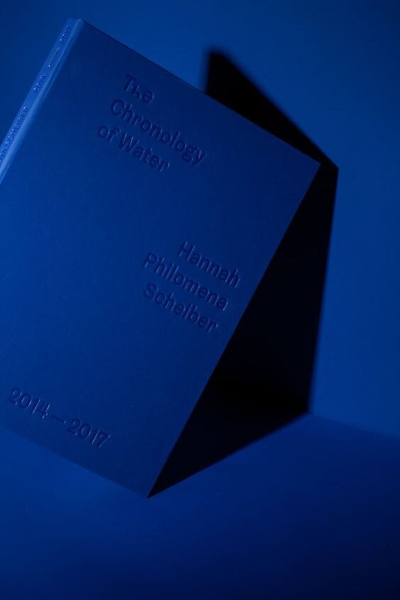
Inspiration Image Credit (L to R): Hannah Scheilber- The Chronology of Water. Pierre Croco Illustration-Instagram. Ciaran O’Brien-Unsplashed. Annabelle Edge-Geometric Collection 2018- Behance. (All photos have been linked to original source.)

#theyolkmelodrama
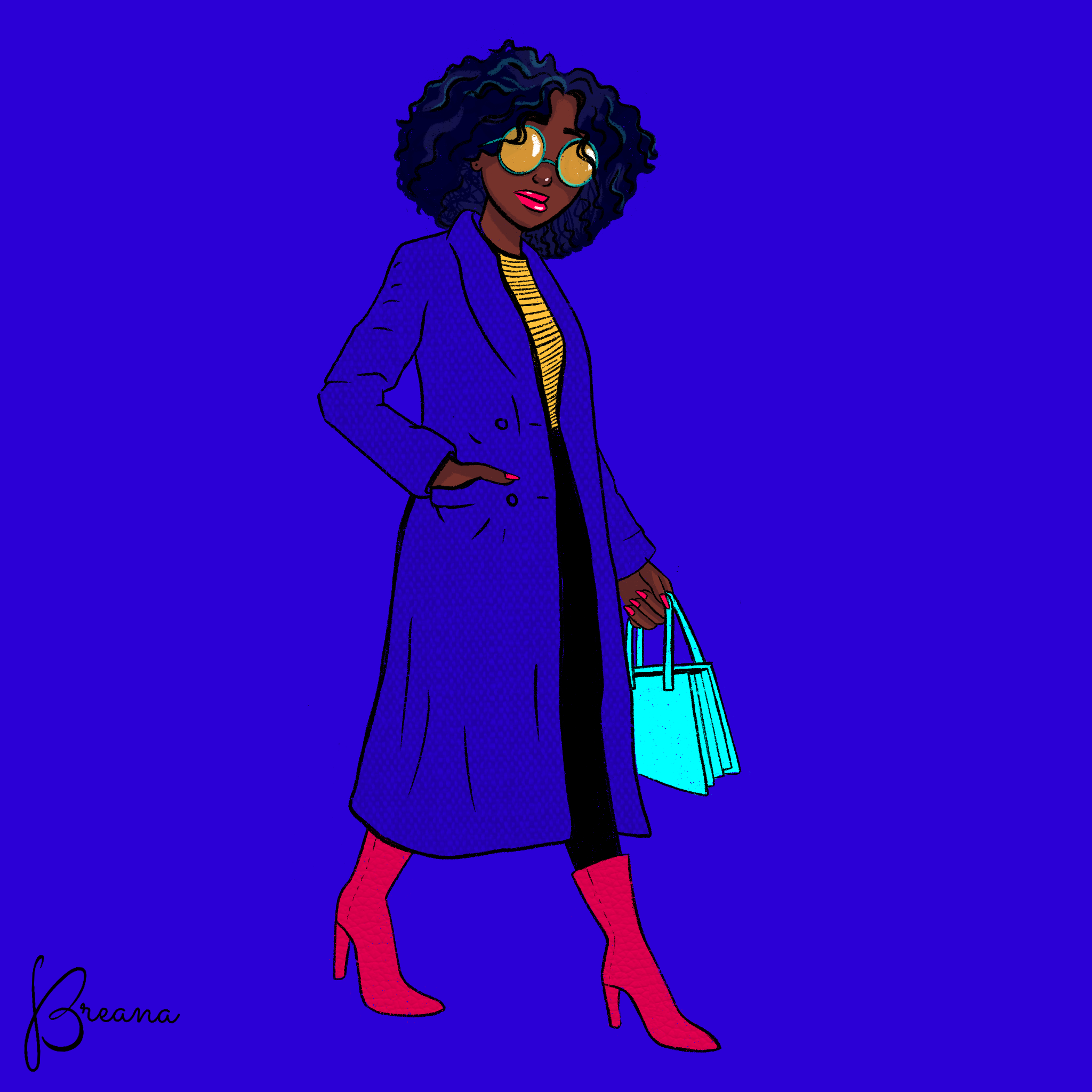
As promised, the DESIGN CHALLENGE! Create a piece of art in a square format, featuring the monthly color, and post to Instagram using the tags @hatchcs and #theyolkmelodrama to enter the challenge!**
July’s color story is all about our moody beauty, Melodrama, so make sure she has the spotlight in your piece as well. To kick things off, Bre and I took on Melodrama with a couple of digital illustrations. We can’t wait to see what you come up with! And make sure to check back each month for a new Color Story.
Full details on our Monthly Design Challenge, including instruction on how to participate, are listed below. Thanks!
Melodrama
Color Formulas
HEX #1A00CF
RGB 26, 0, 2017
CMYK 91, 86, 0, 0

Design Challenge Deets
**Please read the following carefully.
By tagging your piece on Instagram as part of the design challenge, you are agreeing to allow Hatch to use your image in a future blog post and/or other blog promotions with credit listed in the form of your Instagram username. Complete challenge instructions and disclaimers are as follows:
How the challenge works:
Each month we will unveil the color of the month, just as we did here.
We’ll give you tons of info and inspo (aka: inspiration) to get you started.
Then YOU will create a square design, illustration, or any form of art featuring that color.
Post it to Instagram by the end of the month! Make sure to tag Hatch @hatchcreativeservices and use that color’s unique “color coded” hashtag so we can find your entry. July’s hashtag is #THEYOLKMELODRAMA
We will review all of the entries and pick a few favorites to be featured in the next month’s Color Story post!
DISCLAIMErs
The Yolk Color Story Design Challenge is FREE to enter. There are no fees, forms, or other requirements to submit an entry.
This is a friendly, creative design challenge open to anyone who wants to participate.
A number of entries will be selected by Hatch to be featured in the next month’s Color Story. There are no prizes or other incentives. Just the sweet, sweet feeling of creating art and connecting with other creatives.
This design challenge, Hatch, The Yolk, or any of our collective entities, are in no way sponsored, endorsed, or administrated by, or associated with, Instagram.