

Color Story: Oasis
We’re bringing color stories back! Let’s bring in the new year with a deep and rich turquoise…hello 2021, and hello Oasis.

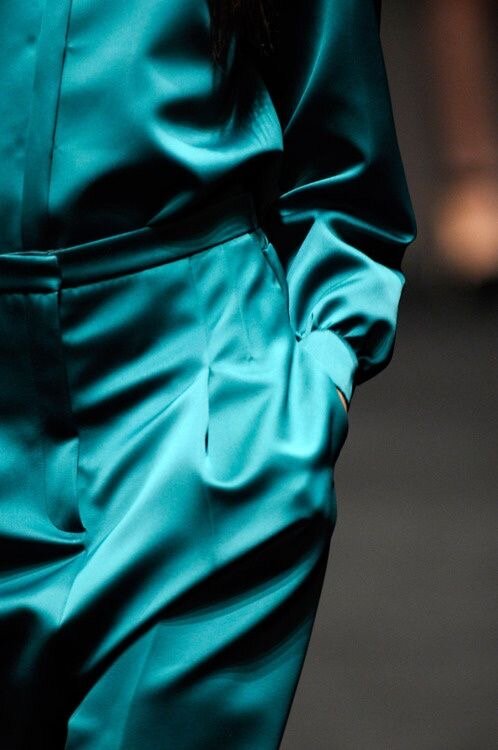
This month’s color story is for those of you who dream of as an accent in your house someday…or is that just me? Seriously though, it’s impossible not to get lost in this color. It’s versatility and mystery make it one of the best compliments to any color palette. Throw it with a rusty orange and yellow ochre? Boom: the perfect 70’s aesthetic. Throw it with some monochromatic blues and you’ll get the perfect ocean dusk theme.

An Oasis is widely defined as a fertile area in dry and desert areas. It provides habitat and hydration for the native animals. Much like it’s name, this Oasis can be paired easily with warm neutrals to provide a similar affect. It can be used to provide contrast and enhance rich-ness in whatever it’s applied.
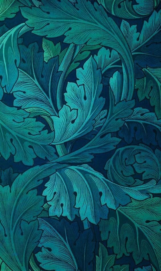
Being the art history Nerd that I am, I found myself consistently inspired by the use of this Deep teal in pieces from The Golden Age of Illustration. Hint: The illustration on the cover photo is a print from William Morris)

Join me as I muse over the use of Oasis by old Illustration masters…
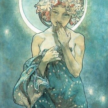
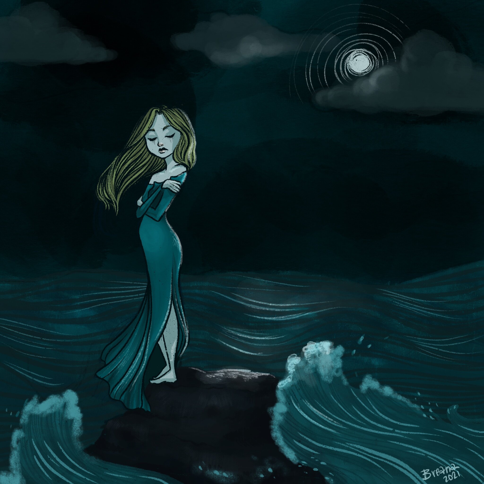
William Morris (left) used different hues of blue to compliment the teal in his print design below. Maxfield Parrish (middle) is actually known for using a color like Oasis for his underpaintings, causing the teal to shine through and create a unified mood. Alphonse Mucha (right) utilized teal in many of his poster designs and here we see it in a painting titled “Moonlight” where the mystery and mood is set with the use of teal.
OASIS MOOD
To me, Oasis gives off a deep, mysterious and almost calming mood. I could see myself diving in and I would love to view everything through the deep teal hues, like everything around me was a Maxfield Parrish painting.
A Deep, Mysterious, and almost Calming mood.
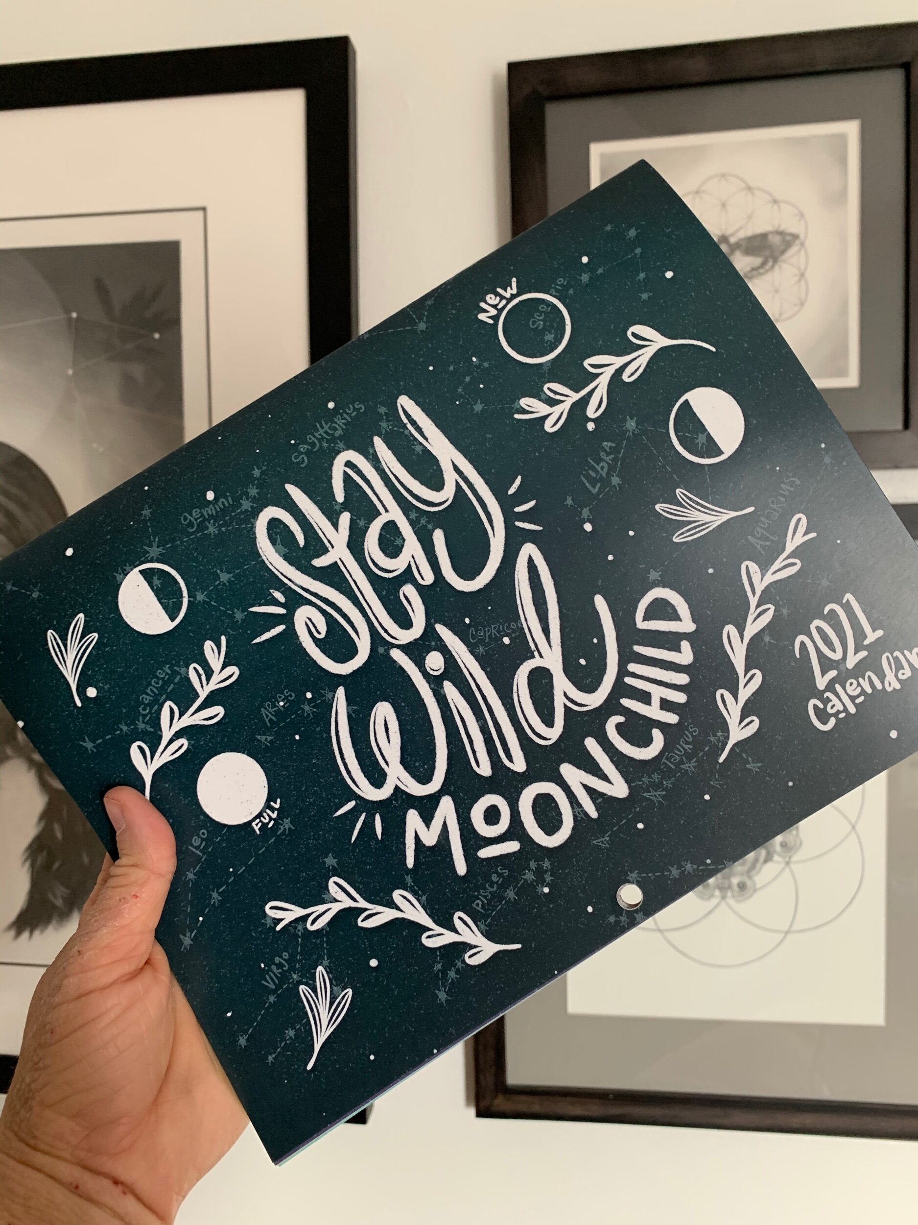
Whether it’s graphic design, illustration or photography Oasis is undoubtedly versatile and complex. You can see it in Hello Hatchlings’ Stay Wild Moon Child calendar cover, I felt Oasis created a dark-sky mood without it being scary or too deep.

COLOR PALETTES

VINTAGE APPEAL
As I said above, Oasis paired with some warm neutrals, it creates an almost cooling appeal, creating contrast in an otherwise analogous color palette.
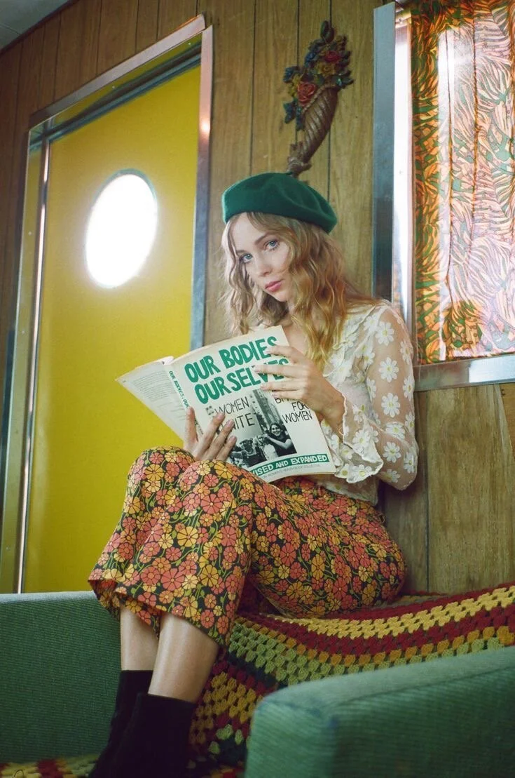
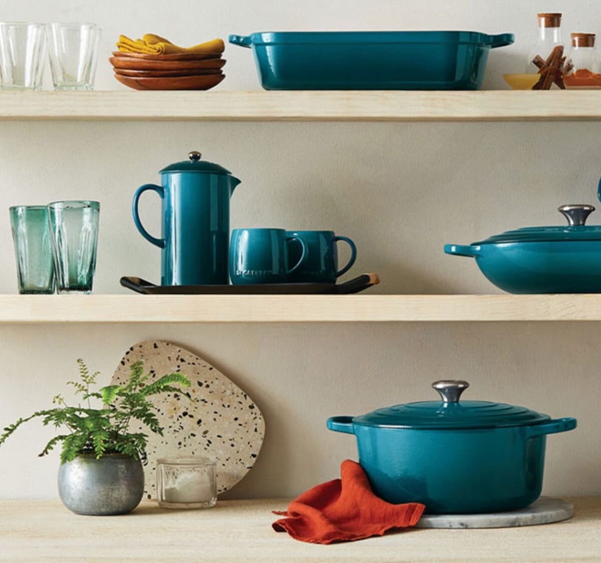
Inspiration Image Credit (L to R): Lucid Muse. Fy Interiors. Le Creuset. Minted. (All photos have been linked to original source.)

COOL BLUE
This is Oasis’ tropical spotlight. A monochromatic mood until you pop that pink in, creating a playful and bright compliment to Oasis’ deep hue.
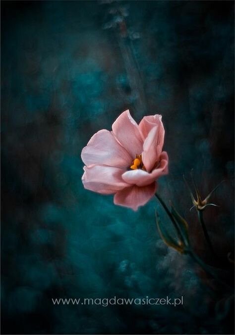
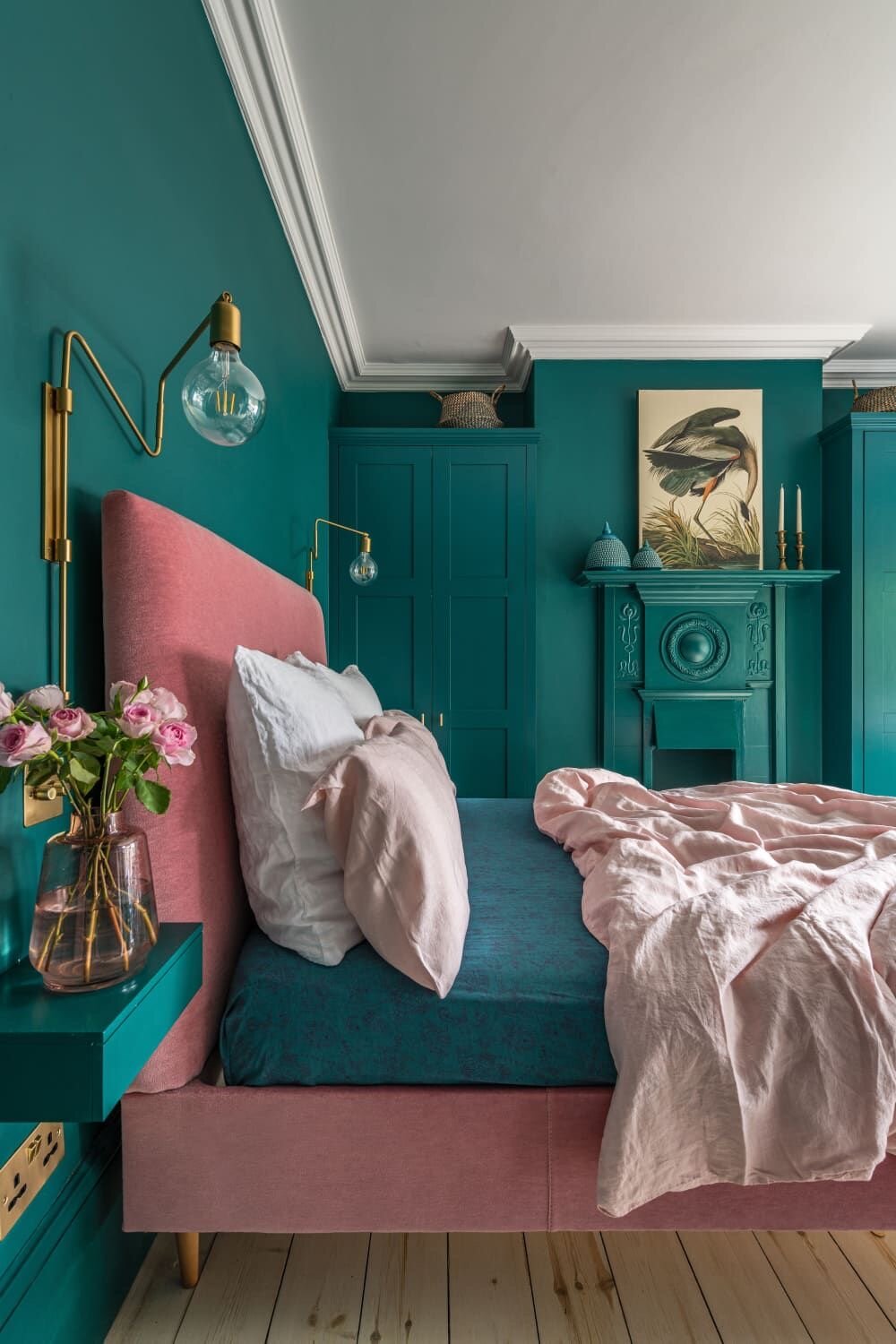
Inspiration Image Credit (L to R): Magda Wasiczek Photography. Apartment Therapy. Unknown. Missy Ames Studio. (All photos have been linked to original source if possible.)

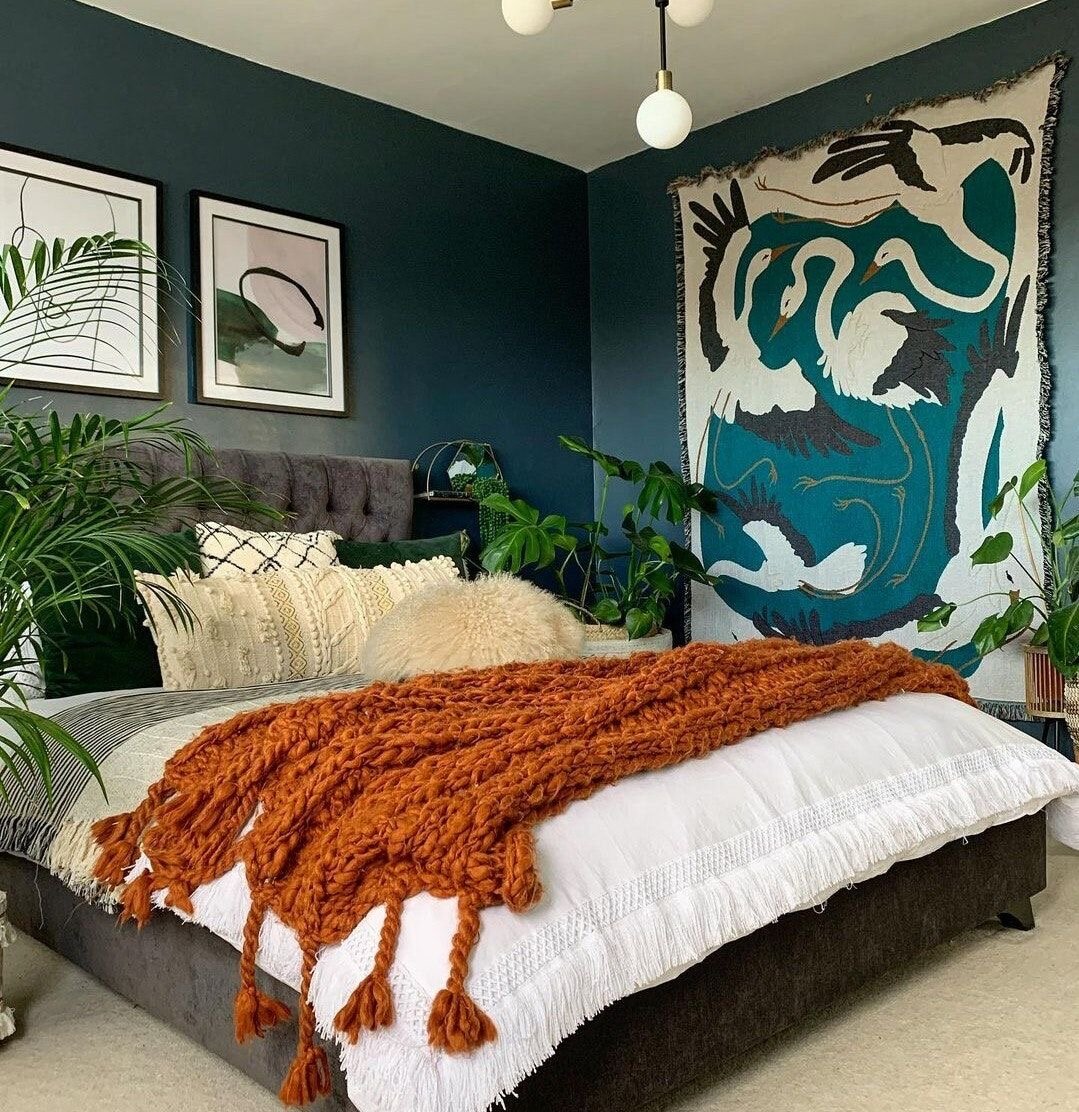
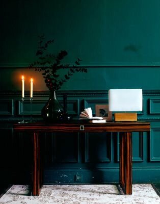
DUSK HUE
Keeping things dark and mysterious when paired with an equally dark but more-Prussian blue. While Oasis is easily complimented by oranges and pinks, a deep blue is another way to keep everything rich and cooled off.
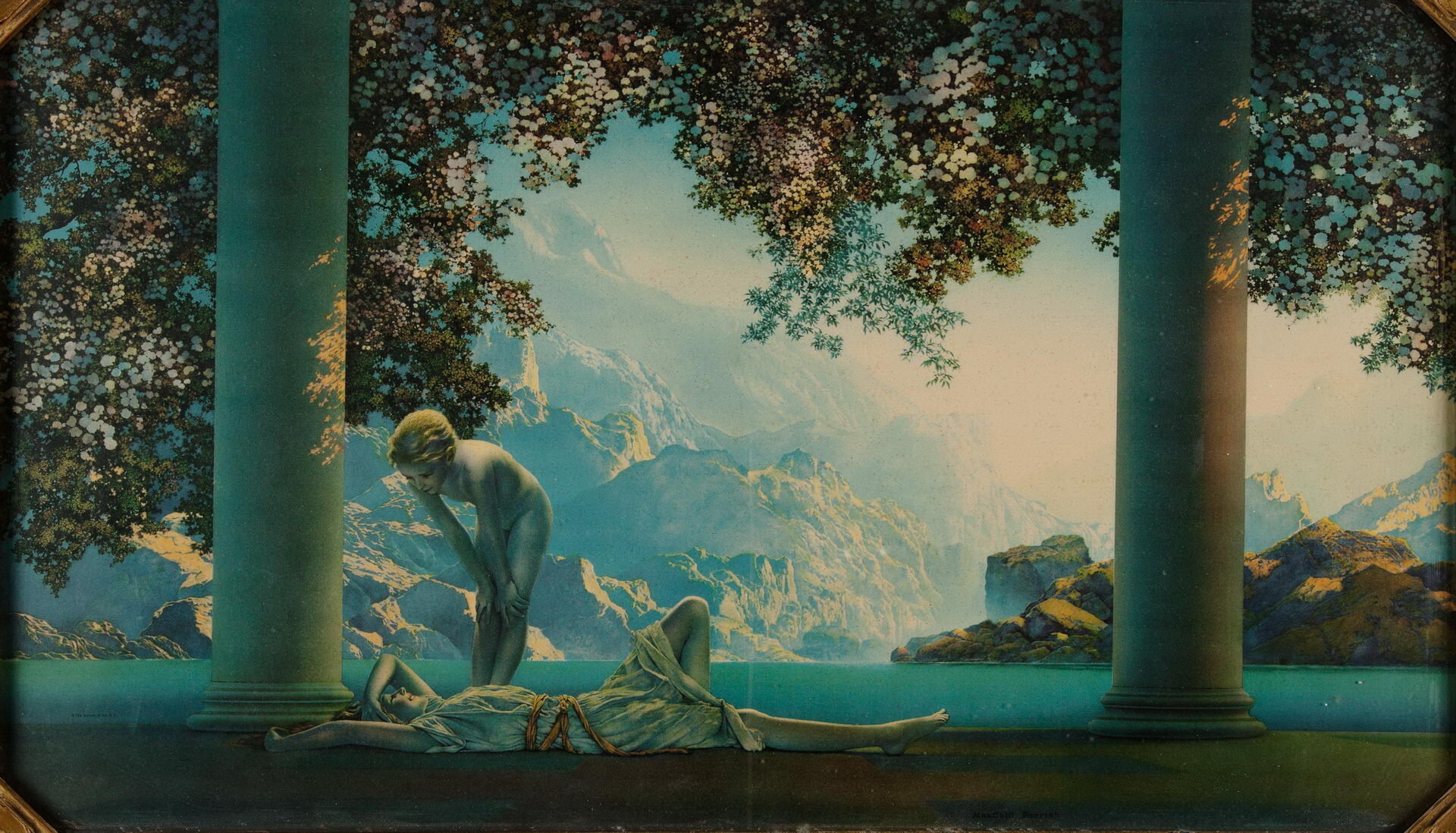

Inspiration Image Credit (L to R): Maxfield Parrish. William Morris. Hello Hatchlings. Unknown. (All photos have been linked to original source if possible.)

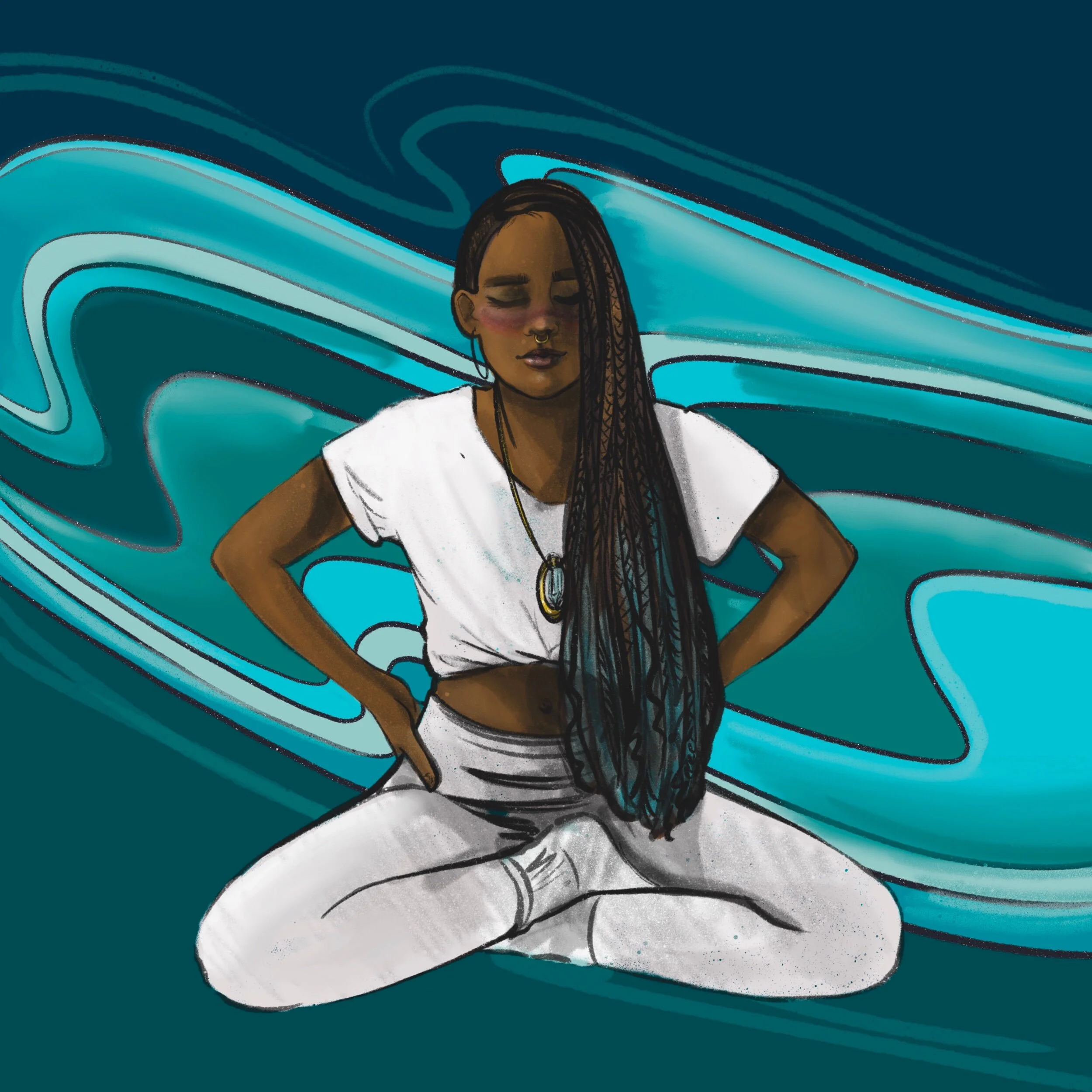
#theyolkOASIS
Join in on our month DESIGN CHALLENGE! Create a piece of art in a square format, featuring the monthly color, and post to Instagram using the tags @hatchcreativeservices and #theyolkoasis to enter the challenge!**
Full details on our Monthly Design Challenge, including instructions on how to participate, are listed below. Thanks!
Oasis
Color Formulas
HEX #0f4c54
RGB 15, 76, 84
CMYK 91, 55, 53, 35
Devin and Bre’s Oasis Design Challenges!
Design Challenge Deets
**Please read the following carefully.
By tagging your piece on Instagram as part of the design challenge, you are agreeing to allow Hatch to use your image in a future blog post and/or other blog promotions with credit listed in the form of your Instagram username. Complete challenge instructions and disclaimers are as follows:
How the challenge works:
Each month we will unveil the color of the month, just as we did here.
We’ll give you tons of info and inspo to get you started.
Then YOU will create a square design, illustration, or any form of art featuring that color.
Post it to Instagram by the end of the month! Make sure to tag Hatch @hatchcreativeservices and use that color’s unique “color coded” hashtag so we can find your entry. Oasis’ hashtag is #THEYOLKOASIS
We will review all of the entries and pick a few favorites to be featured in the next month’s Color Story post!
DISCLAIMErs
The Yolk Color Story Design Challenge is FREE to enter. There are no fees, forms, or other requirements to submit an entry.
This is a friendly, creative design challenge open to anyone who wants to participate.
A number of entries will be selected by Hatch to be featured in the next month’s Color Story. There are no prizes or other incentives. Just the sweet, sweet feeling of creating art and connecting with other creatives.
This design challenge, Hatch, The Yolk, or any of our collective entities, are in no way sponsored, endorsed, or administrated by, or associated with, Instagram.